The central concept behind Kreathink®’s logo is to create a brand that is easily recognizable and understood at a glance. We love that industrial style that conveys hard work, innovation, and technological development. The name itself aims to describe everything that our organization stands for. The style is minimal, with a powerful use of black, and the typography is a classic grotesque font that communicates tradition and quality.

We ensure a consistent visual identity by aligning all images, styles, and plans with the latest technology. This results in a strong brand presence across all platforms, supported by a solid design and organizational foundation.
Our workflow involves experimentation and learning from each project to refine our methods and strategies, enabling us to adapt quickly, stay innovative, and focus clearly on delivering high-impact designs.
We approach our work pragmatically, guided by research and a deep understanding of market trends. Our conscious decision-making ensures that brand strategies align with client needs, balancing creativity with real-world business objectives.
Our work is modern and fearless, reflecting the spirit of entrepreneurs and innovators. We push creative boundaries to deliver impactful, future-focused branding solutions that empower businesses to succeed.
This palette, as a whole, signals a brand that balances emotion and logic. While black and gray communicate stability and control, cyan and white emphasize creativity, innovation, and transparency. This palette creates an overall feeling that Kreathink®, a forward-thinking company, is both powerful and creative, offering structured solutions that are clear, simple, and easy to implement.
Vazirmatn is a type developed by Google®, classified as a sans-serif font, characterized by clean lines and the absence of decorative elements at the ends of strokes; this family improves reading times, helps structure visual information according to hierarchy, and stimulates Kreathink® to look and feel industrial.
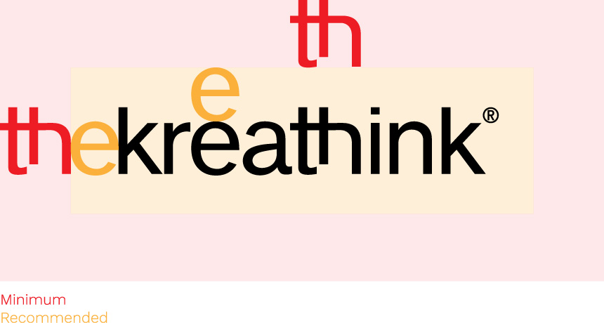
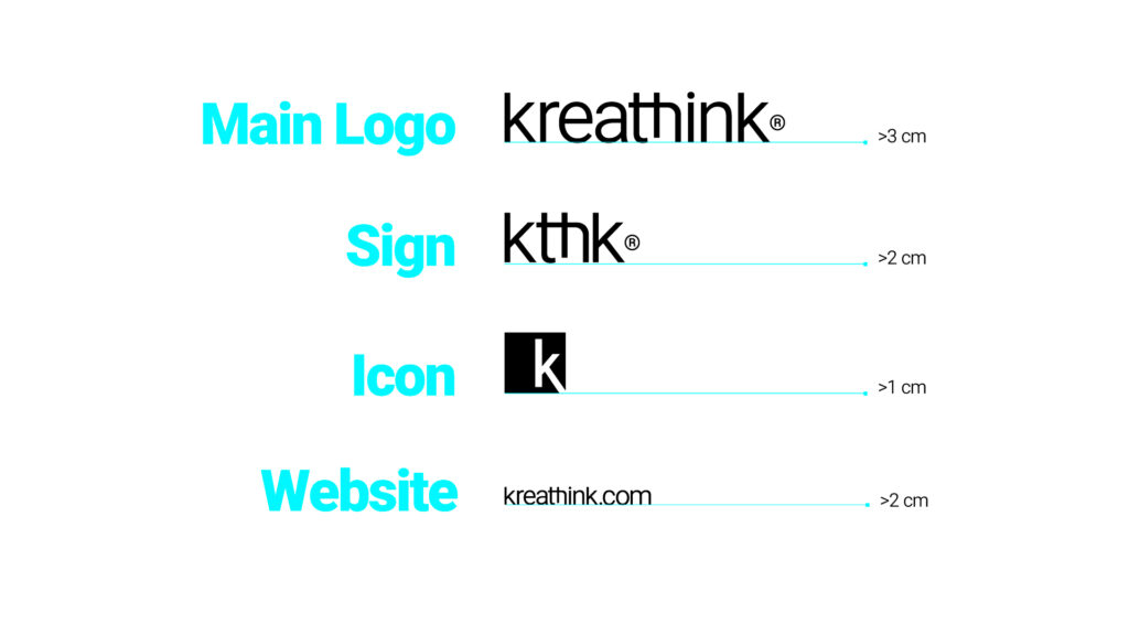
Our logo is a combination of text, images, symbols, and colors that distinguishes our brand or company from the competition. It serves as a visual representation that creates a connection with the audience or customers.


Accent Color Icon


Black Color Logo

Think of our icon as a brand’s stylistic extensions. Once the big picture of a brand’s messaging has been established, icons serve as visual tools that help carry out this message. Also, icons are useful elements that can be consistently used across diverse platforms.
Primary Color Icon
Secondary Color Icon
White Color Icon
Black Color Icon
Primary Color Icon

Secondary Color Icon
Accent Color Icon
White Color Icon

Black Color Icon
Seasonal Color Icon
Every application of our logo should strengthen and reinforce the organization’s positive image. The logo is a fixed design element that may not be edited, but the color composition may change depending on background images, colors, or materials.
White
Primary Color
Secondary Color
Accent
Black
Seasonal Color


N/A


N/A


To ensure that our logo is always recognizable, it must
be used consistently, with discipline, and with precision.
The power of a logo is easily weakened by its incorrect use.

X
No Compress

X
No Expand

X
No Blur

X
No Borders

X
No Skew

X
No Flip

X
No Arbitrary Rotation
X
No Crazy Colors

X
No Incomplete
X
No Art Filters
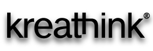
X
No Shadows
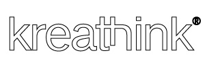
X
No Outlines
(307) 369-1216
Headquarters
1603 Capitol Ave.,
The Majestic Building, Suite 211.
Cheyenne, WY 82001.
United States.
Satellites
Dallas, United States.
Quito, Ecuador.